Elementor is a great page builder for WordPress that keeps getting better. The main reason I love Elementor is because it lets you create so much without needing to write code or do complex development work.
One cool feature I want to show you today is how to use Elementor’s sticky header and navbar. Specifically, I’ll show you how to create the effect where the logo shrinks when you scroll down the page. This is all possible with Elementor!
Header Preview
Creating a Shrinking Logo on Scroll with Elementor’s Sticky Header & Navbar
Making the logo shrink when you scroll down is just one of many cool effects you can create with Elementor’s sticky navbar. The method we’ll use in this tutorial can also be applied to other scroll effects, such as changing the background from transparent to solid, altering background and link colors, or even swapping your logo from light to dark using Elementor’s sticky navbar.
For now, we’ll keep things simple and focus on just one effect: making your logo shrink when you scroll down. But don’t forget to check out the other tutorials for more ideas!
What You’ll Need for This Tutorial
To create the shrinking logo effect on a sticky header, you don’t need any third-party plugins or widgets—everything can be done using just Elementor. However, you will need the Pro version of Elementor. If you don’t have it yet, bookmark this page, grab the Pro version, and then come back. The Pro version is definitely worth the investment for the extra features it offers. You can find the Pro version here.
Step 1: Building a Menu in Elementor’s Theme Builder
First, go to your Templates and select Theme Builder. If you don’t have a header set up yet, click to add a new header. If you already have a header, simply edit that template.
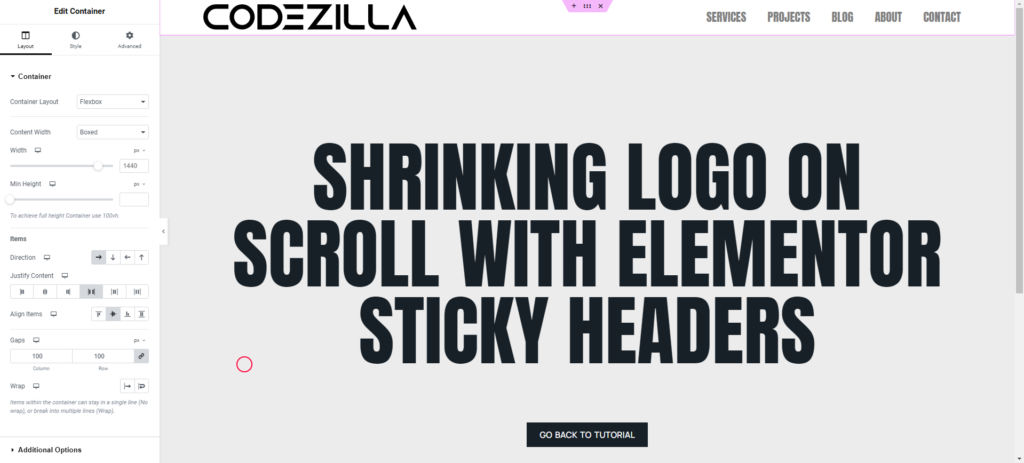
Next, make sure to add the WordPress Menu widget (formerly called the Nav Menu widget) and the Logo or Image widget to the container that you want to stick to the top of your site. The layout should look something like the image below.
Step 2: Setting Up Your Logo with Elementor
When setting the size for your logo, make sure to use pixels (px). This is important because it helps control the exact size you want your logo to shrink to. While I usually use REM for most of my sizing, there are cases where pixels are better since they provide an absolute size. This is one of those cases.
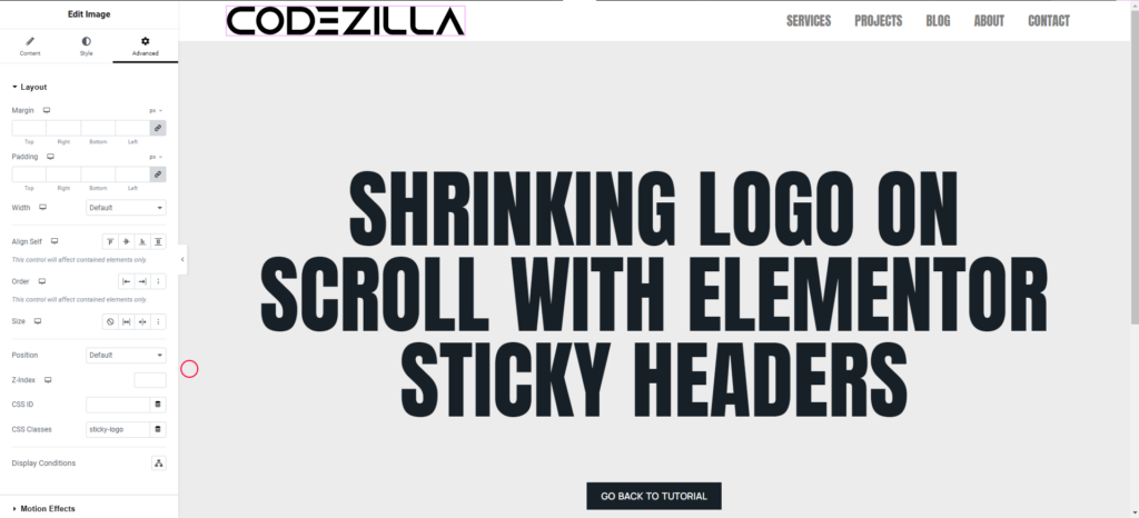
Now, go to the Advanced tab, and under CSS Classes, add the class sticky-logo. It should look like the image below.
Step 3: Setting Up the Sticky Header & Sticky Navbar in Elementor
Now, let’s add the sticky effect to your header. This tutorial is updated for the newer Flex Containers, but the older tutorial used Elementor’s Sections.
- Select the container that wraps your logo and menu—this is the part you want to stick to the top of the page.
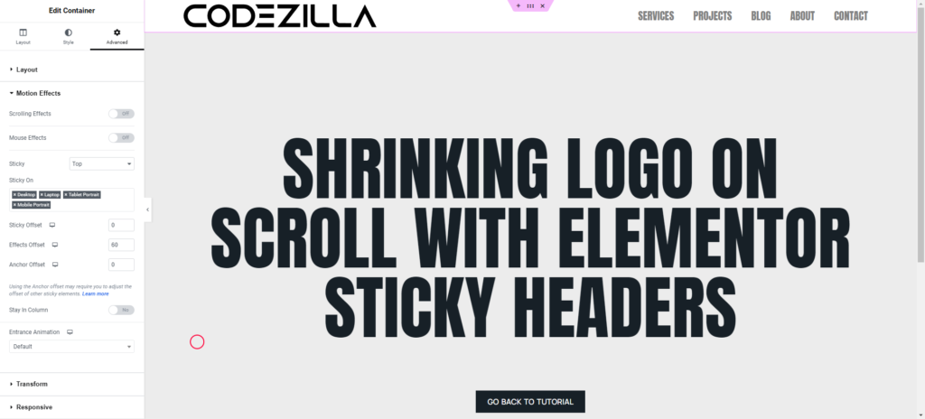
- Go to the Advanced tab and open the Motion Effects section. In the Sticky option, choose Top.
- After enabling the sticky effect, a few new options will appear:
- Devices: You can choose which devices the sticky header will appear on. For example, you might want the header to stick on desktop and tablet, but disable it on mobile. To disable it on a device, simply click the ‘X’ on that device.
- Offset: This controls the vertical position of your container. Leave this at 0 for now, as we won’t need to adjust this in this tutorial.
- Effects Offset: This is the key setting for the effects, like the shrinking logo. The Effects Offset controls how far you scroll before the effect happens. For instance, if you set it to 100, the logo will shrink after you scroll 100 pixels down the page. Choose how far you want your visitors to scroll before the effect triggers.
Once you set the Effects Offset, a new CSS class will be added when you scroll past that point. This is how Elementor triggers the effects as you scroll. Your Effects Offset should look like the image below.
Step 4: Making the Logo Shrink on Scroll in Elementor’s Sticky Header
To make the logo shrink when you scroll, we need to add a small CSS snippet. Don’t worry if you’re not familiar with CSS—simply copy and paste the code below, and I’ll show you exactly where to add it.
/*--SHRINKING LOGO--*/
/*--New class when sticky is turned on 'elementor-sticky--effects'--*/
/*--give the logo image a class called 'sticky-logo' --*/

.elementor-sticky--effects .sticky-logo img {
	width: 120px!important;/*--edit the pixels to change to desired shrinking size--*/
}

.sticky-logo img {
	transition: .5s all ease-in-out;
}


@media screen and (max-width: 767px) {
    .elementor-sticky--effects .sticky-logo img {
	width: 90px!important;/*--edit the pixels to change to desired shrinking size for mobile--*/
}
}
Go to the outer container, then click on the Advanced tab. Scroll down to find the Custom CSS section. This is where you’ll paste the CSS snippet I provided. Once you do this, you should see your logo shrink as you scroll!
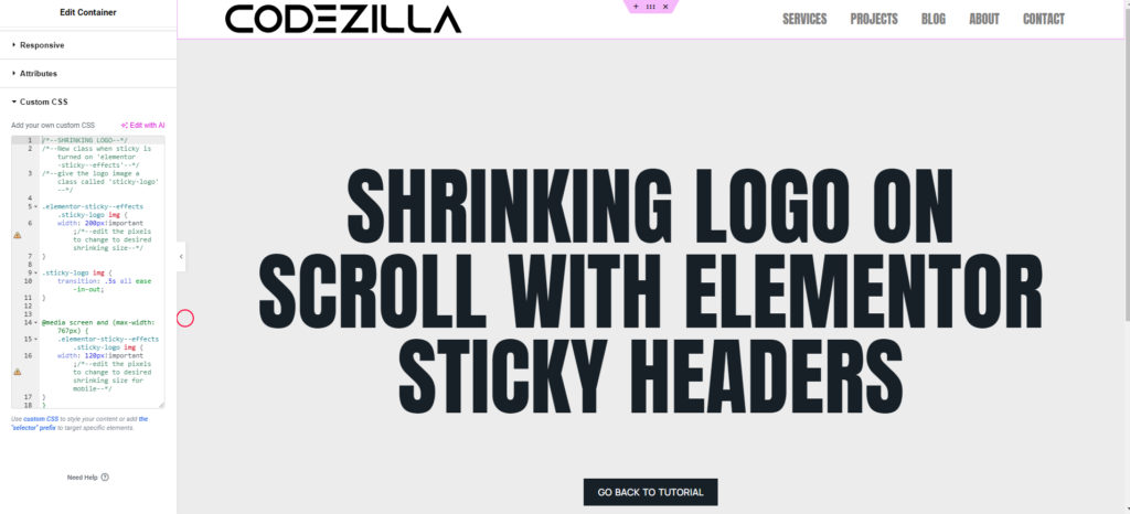
The next step is to decide how much you want your logo to shrink. You can adjust the size by modifying the max-width value in the CSS snippet. For example, setting it to 100px will make the logo shrink to that size. Feel free to experiment with different values until you get the desired look!
Step 5: Editing the CSS to Change the Size of Your Logo on Scroll
There are three parts in the CSS code, and I’ve included helpful notes within /*notes*/ to guide you.
The first section is where you can control how much you want your logo to shrink. You’ll notice that the size is set in pixels. This is why we used pixels for the logo size earlier—it makes it easier to decide exactly how much you want the logo to shrink.
Simply adjust the pixel value in the CSS to your preferred size. For example, changing max-width: 100px; to max-width: 80px; will make the logo shrink even more.
.elementor-sticky--effects .sticky-logo img {
	width: 120px!important;/*--edit the pixels to change to desired shrinking size--*/
}
The second section controls how slow or fast you want the transition effect to be. It’s currently set to 0.5s, which means the logo will shrink over half a second. You can adjust this number to change the speed of the effect.
For a smooth transition, a range of 0.2s to 0.5s is usually a good choice. Just change the number to suit your preferences. A smaller number will make it faster, and a larger number will make it slower.
.sticky-logo img {
	transition: .5s all ease-in-out;
}
The third section is for mobile devices. Since you’ll likely create a mobile version of your menu with a smaller logo, this part of the CSS allows you to make the logo shrink even more specifically for mobile.
You can adjust the max-width for mobile separately by targeting mobile screen sizes. This ensures that the logo looks appropriately sized across different devices. Simply edit the CSS to define a smaller size for mobile if needed.
@media screen and (max-width: 767px) {
    .elementor-sticky--effects .sticky-logo img {
	width: 90px!important;/*--edit the pixels to change to desired shrinking size for mobile--*/
}
}
The Possibilities of Elementor’s Sticky Headers
Elementor offers several ways to add creative effects to your headers and menus. You can create effects like changing your header background from transparent to solid on scroll, altering the colors of your header’s background, shrinking the entire navbar on scroll, or even swapping logos as you scroll—all using the Effects Offset method.
By enabling the Sticky effect with Elementor, you can create a class that activates once the Effects Offset value is reached (.elementor-sticky-effects). With a bit of CSS, this opens up many creative possibilities for enhancing your site. These effects not only make your site look more dynamic but also improve the user experience for visitors.
Be sure to subscribe to our newsletter to get updates on future Elementor tutorials, tips, and tricks.
